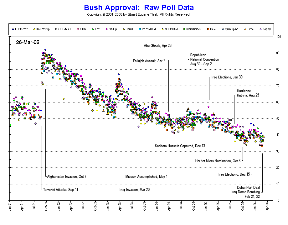
courtesy of professor pollkatz, i bring you a graph of president bush's approval rating, as reported by 14 leading polling organizations, during the life (and tortured death) of his ongoing presidency. click either the graph or the following link to see the graph in full size.
notice that i've taken the liberty of mapping the key events that i believe triggered the various crests and troughs in the public's perception of their dear leader.
also notice the scatter in public opinion prior to the terrorist attacks on september 11, 2001.
Tuesday, March 28, 2006
connecting the dots
Subscribe to:
Post Comments (Atom)


No comments:
Post a Comment